Labels

Friday, 27 January 2012

Evaluation - Advert Conventions


These two images are both album adverts of my genre.
 
The image above is an album advert for the artist called Drake. Within this advert a lot of information is shown in a little amount of space. The following are conventions of the album advert:

·         Big bold and clear title at top of page showing artists name, ‘DRAKE’.

·         The white font colour contrasts with the black background making the title stand out from a distance.

·         A large image of the artist in the centre of the page. Drake is an iconic person with modern music and by including his face in the advert, allows people to recognise him and refer to his music. Drake has very much his own image and brand identity.

·         The white clear font continues throughout the advert showing when the album is out and other artists that feature within the album such as Rihanna. It also states additional features that the album includes

·         The advert shows the records labels and logos at the bottom of the page, also in white which contrasts with the black background, making it clear to read


Another album advert which shows familiar conventions of my genre is ‘The Streets’. The following are conventions of the above album advert:

·         The main centre of attention is the distinctive image of a block of flats.  When looking at the image it is clear to see that in the middle window there is a man standing who is Mike Skinner. In order to grab our attention, the lights of the flat room are pink which is very noticeable as it contrasts with the dark grey walls.


·         The advert also has a basic and clear font in white showing the release of the advert.

·         The record label and other information such as the website address is also in white as it stands out against the dark colours in the bottom of the advert.


·         A very significant part of this advert is the lighter that has ‘STREETS’ written along it, and also ‘Computers and Blues’ above it which is the name of the album. In every album and single, ‘The Streets’ includes a lighter of a different colour making it very significant and distinctive them, and has also helped them to build their brand identity.

Tuesday, 24 January 2012

Peer Feedback of Ancillary Tasks


The above document shows a peer assessment of my DigiPak design performed by Cameron Roberts. The assessment shows that in particular areas I done better than others. For example, I received the highest level in the following areas:
  • Showing awareness of the need for variety in fonts and text size
  • Selecting mise-en-scene including colour, figure, lighting, objects and setting
  • Manipulating photographs as appropriate to the context for presentation, including within text, within particular IT programmes, cropping and resizing
On the other hand, there are areas that still need to be improved such as:
  • Accurate use of language and register
  • Variety of shot distances

Thursday, 19 January 2012

How I Used Media Technologies In The Construction and Planning, Research and Eval

How Did We Use Media Technologies


This above video is an addition to my other post. I created the video to show me using technology. In order to create it I used Final Cut and YouTube.

Wednesday, 18 January 2012

DigiPack Back Cover Design


Below are some DigiPak designs which I have created. They are both very alike however they have some slight changes which are obvious. For example, the use of the yellow font instead of the white font make the text on the wall looks much more prominent and eye catching. On the other hand, the second DigiPak design not only has a different font colour but the contrast of the brick work is much greater. Our reasons for choosing this is because it makes the bricks look much more bolder and darker, therefore making the white font colour contrast effectively against the opposing colours.

The reasons for choosing this design were to enforce our brand identity and resemble connotations given off from our music video. For example, our ideas for our music video were to make it look very ‘Street’ and ‘Urban’, therefore we have chosen to use the brick wall. Our font type is very bold and a font style that can relate to the genre of our music.

Therefore, I believe that with a good and effective combination of the colour of font and high contrast of the brick work, the back side of the DigiPak will work well.


Friday, 13 January 2012

G324: Advanced Portfolio Evaluation


In the evaluation the following questions must be answered:

In what ways does your media product use, develop or challenge forms and conventions of real media products?

·         A video comparing our music video to a similar one by ‘The Streets’. Have a whiteboard in the background playing the selected videos
·         Show conventions of music video and advert
·         Compare advert with another professional advert of the same genre.
·         Print screens
·         Take small clips from music videos off YouTube, and show how that inspired that
·         How we have created a band image
·         Demographic

How effective is the combination of your main product and ancillary texts?

·         Show a video/document comparing how each are similar to one another including the colour and fonts.
·         Show how this relates to our brand image and can relate to the target audience

What have you learned from your audience feedback?

·         Film a trail screening of the audience watching music video, looking at digipak/advert ideas and get their opinions on the film/analyses them
·         Show personal responses to our product
·         Make a video/document showing how feedback made our video better
·         Create a questionnaire using survey monkey

How did you use media technologies in the construction and research, planning and evaluation stages?

·         Create a JING project and demonstrate how I used some basic skills in Photoshop, Final Cut and Blogger
·         Have a little film of our group using some of the technologies like Camera, Final Cut etc. and insert comments onto YouTube
·         Create a word document showing different types of media and technologies that we used – can show how it helped us too
·         Show pictures of using equipment and how I have developed my technologies


Tuesday, 10 January 2012

Photoshop - DigiPack Tester


Here is an example of what I achieved when trying to become familiar with Photoshop. To begin we took a standard photograph from the internet where we then uploaded it to Photoshop and began editing. 

Examples of effects that we applied to this photograph include a sketchy and cartoony effect. Our primary choice for using these effects was to make it look as if it was hand drawn by an artist. Once having changed our background images us then aside created a title. In order to achieve this we downloaded the font named 'URBAN JUNGLE' from a font database website called 'DaFont'. We also applied a number of effects to our title such as an outline glow. The reason for doing this was because when altering the transparency of the font it was hard to see at first and was not ideal to catch the audience’s attention. We believed that changing the transparency of the title would make it seem as if it was all one image, as the title blurs in the brick work. 

When choosing a background image we took time to ensure that the image was for us and showed some sort of brand identity and reflection to our music video. For example, within our music video we have attempted to emphasize the 'Street' and 'Urban' mood by including stereotypical features such as graffiti, and dirty streets. 

I believe that in this photograph the red telephone box is very significant. For example, it firstly reflects on our emphasis of 'Street', but also gives the photograph and attracting centre of attention for the audience. The red letterbox stands out comparatively to the vibrant and bright colours of the brick work, but also shows the rule of thirds.

Thursday, 5 January 2012

Logo Designs

Below are a number of logo designs that I have created. The logo designs include a number of effects which I believe is very reflective of our genre and song choice.
1)
The difference between the two is the slight blured effect and the colour alterations.   

2)


Friday, 9 December 2011

Storyboard Anamatic


This is a small video that was put together to show our storyboards. We made this by originally taking still images of our storyboards but more specifically focusing on the actual image. Once we had taken all the pictures we then uploaded them to iMovie where we then put them altogether and in a video form. After doing this we added the soundtrack to add the emphasis of the shots, and allow our ideas to be seen and related to the lyrics of the song.

Song Details - Lock The Locks (The Streets)

Lock The Locks is one of the tracks that I was most looking forward to listening to from The Streets’ new album Computers & Blues, and after hearing it I am glad that I’m not coming away feeling disappointed. Claire Maguire switches her vocal style up effortlessly to provide an instantly catchy hook and Mike Skinner does his thing as usual, signing off on the final track on the album with a bang.
Computers and Blues is the fifth album by The Streets and the final one Mike Skinner plans to release under this alias, officially released in the United Kingdom on 7 February 2011. It contains 14 songs, including an appearance from British singer-songwriter Clare Maguire which of course is in this song lock the locks.
Computers And Blues finds Mike Skinner calling time on his Streets name, and on this album closer he raps about moving on. Said Skinner to The Daily Record: "Recording this song did make me emotional, but it didn't make me emotional about The Streets. It made me emotional about leaving jobs, which I have done... though not for a long time, admittedly."
The song features British singer-songwriter Clare Maguire, who was announced on January 3, 2011 as coming in fifth place in the BBC Sound of 2011 list of the most promising new artists. She told Digital Spy about the collaboration: "Being in the studio with Mike Skinner was amazing - apparently Mike said to my manager while I was singing, 'Oh I didn't realise she could write as well!' He took away the chorus I'd come up with it and put his own song around it, which is just insane and brilliant.

Tuesday, 15 November 2011

Shooting Schedule


This is an example of our groups shooting schedule. As you can see we have allowed ourselves a couple of weeks in order for us to complete all filming. We specifically allowed this time in case we had to re-shoot or we had forgotten the first time. We will be travelling to our shooting destination so we also must enable some notice. Me, Nathan, and Ryan will all take part in the filming process whether its acting or filming the shot.

Creating a shooting schedule allows us to become organised with our work and allow us to understand what we have to do with a week or more in advance.

Lyrics Annotation


Talent Release Forms

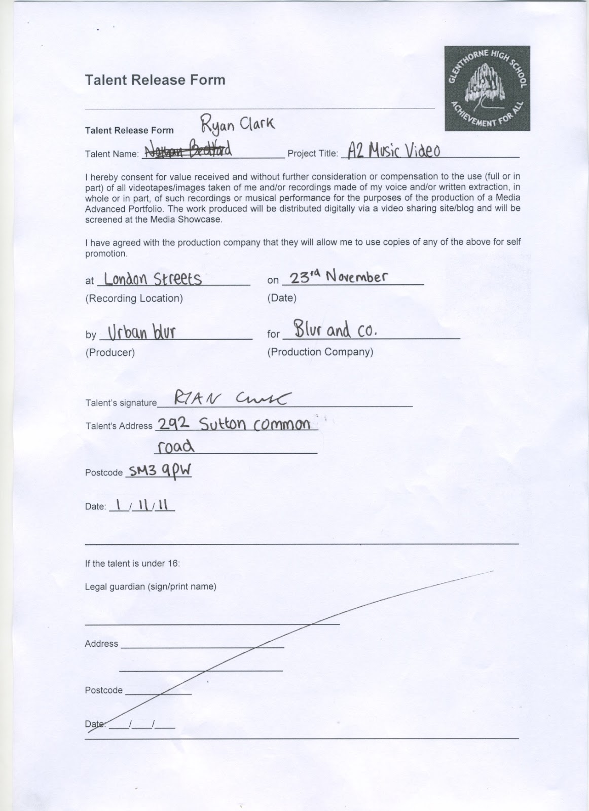
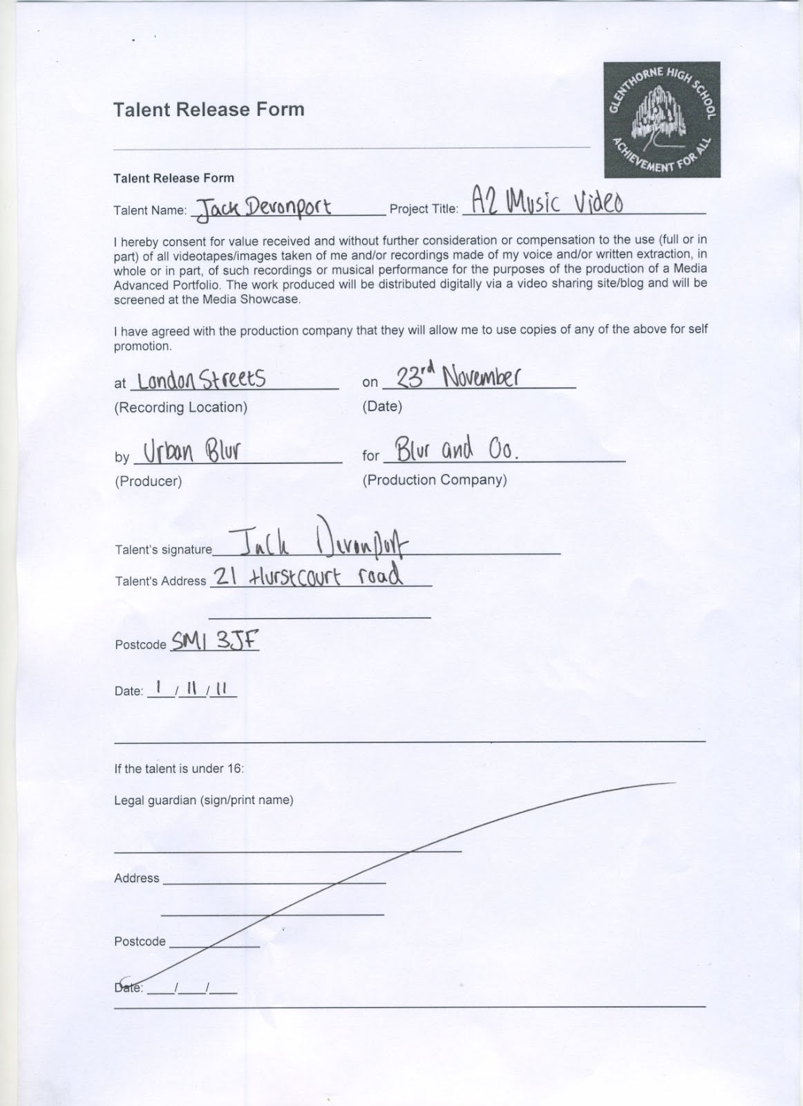
The following forms are all talent release forms. The importance of these forms is to ask for permission whether it will be ok to use them within the film. This will include using them as actors whilst filming, extracting there voice, and possibly using pictures of them in post-production. The form also asks for a signature and authorisation of the actor for being able to go to the locations. An example of this can be found on our talent release forms. For instance, it shows what date we will be filming, where and what he may be using them particularly for.
Nathan Bedford
                                                 
Ryan Clark

Jack Devonport


Friday, 11 November 2011

Location Permission Letter


The purpose of setting up this email was to confirm with the teacher that it would be OK to use the dance room facilities. After sending it out us shortly received an email that confirmed us to use the dance studio. We specifically thought of using this for a location as we believe that it fit into our genre by using a black room with effective spotlighting whilst lip syncing.

Tuesday, 8 November 2011

Assessment - Final Planning check 08th Nov SJA

WWW:

  • Jack, the post on 'technical tutorials' is very good - I am pleased you have responded to some of my earlier feedback
  • List of 'props, costumes & locations' is quite good - could possibly have more development...
  • I really liked your photoshop work on Advert Designs. Really good layout, use of colour and stylised effects. Looks very 'urban' and suits your genre well. I hope you continue down this direction for your digipak cover design.
EBI:
  • You still have al arge  amount of work to do to get this section of your blog complete and up to an 'B' standard Jack. You have the 3 hours in lesson today - and that is it. I do understand that your group had a change of song, but there is NO evidence to suggest that you have spent enough time outside of lessons on developing posts and changing planning to suit your new song. I can see that the last time you posted anything to your blog was Nov 1st. That was a week ago??? So, you are clearly not going home from lessons and investing any time of your own towards achieving in your A Level studies??
  • Lots of posts are missing and your group needs to work together to get these sorted out today:
  • - Song details - missing?
  • - Lyrics Annotation / Image Annotation / Concept - all of these need updating for your new song
  • - Storyboards?
  • - Location shots - these have no written explanation? I have no idea from this post what you intend to do at each location - it is just a collection of images that are meaningless. Why did you choose these locations? How do these locations represent your artist? I can see that these photos are just from Google images - you need to make the effort to scout out your own locations for filming interior and exterior shots - and actually bother to go and take photos of these...
  • - Shooting schedule - missing? (We will not let your group go anywhere to film without these posts complete)
  • - Location permission letters?
  • - Talent release form?
  • - Track permission letter?
Lots of work to do Jack. You achieved an 'A' in media last year - but this was only just an 'A' - not a secure confident 'A'. You clearly did well in the exam last year. The exam in year 13 is a lot tougher Jack. It requires you to comment on issues happening across the world in the news at the moment, and requires a lot of sophisticated thinking and analysis. To be as confident as possible, you must must sure your coursework is going to achieve a really high grade.

You desperately wanted to be with your friends to shoot the music video - but it will only be successful if all of you are prepared to plan thoroughly and think every detail through.

Currently there is so much work missing from your blog, I have to mark it as Improvement Needed. 
You have 3 hours to complete to a 'B' / 'A' standard today. This is actually possible - your group needs to stop wasting time and develop a far more mature approach to completing work. If you understand this, you can work together to get the work done.

SJA

Tuesday, 1 November 2011

Advert Design Draft


Here is an album advert which I created. I created this album advert through the programme called Photoshop. To enable the way that it looks now I had to use a variety of effects and features that Photoshop has to offer. For example, I firstly imported the photo to Photoshop. I then used previous knowledge to apply a range of effects to the picture to make it look effective and appealing. Moreover, I then had to download a suitable font type from ‘daFont’ which I thought would be suitable and attracting to a variety of audiences. After doing this I then put it all together making sure that it looked professional and appealing. For a few extra pieces I extracted the ministry of sound logo and the blackberry barcode scanner to the album advert. By including little extra’s such as the Blackberry barcode enables you to appeal to a younger audience, as data shows that the majority of Blackberry’s are used by people between the age gaps of (16-20). In addition, the use of the ministry of sound logo makes the band and album advert look much more alluring as customers can then see that it is a professional.
DaFont.com

DaFont.com example
Photoshop - Apple Mac

Monday, 31 October 2011

Album Cover Design Ideas

Here is another example of an album that I have created. In this example it uses a variety of effects including colour contrast which makes it look very effective and different to others. Moreover, instead of making the whole cover black and white I made sure that I kept the band name in red. I purposely did this to ensure that it stood out against the black background.

Photo Shoot Schedule

This is a photo shoot schedule which shows the times and date and what we will need for each photo shoot. For example, on 4/11/2011 we have chosen that we going to a busy high street such as Oxford Street, and we will need props, costumes, and equipment including smart and casual clothing, hats, and a still camera.

Creating a photo shoot schedule makes things much more organised, which therefore allows you to know what you are going to be doing on those certain days.

Costume Ideas

This is an image that I have drawn to show different types of costumes that could feature within our music video. For example, this character is show wearing a smart suit, which seems as if he is going out somewhere nice or dressing to impress.
The character is wearing a dark blue suit jacket with smart brown trousers and black polished shoes. This could be an idea of a costume within our music video when the main character goes to see the girl at the train station.

Moreover, we are also thinking of casual clothing to reflect on the urban and street theme. For example the image above is an example of a costume that could work well within our music video. For instance, this costume includes a hooded coat. Hoods are often stereotyped with gang culture and kids on streets, hence why we have included this coat as it could work well with our genre and theme. Also, I have included chinos as part of the costume. I specifically chose these as these are a current high street fashion, meaning that it could appeal to you a young and current market. Lastly, they are wearing boat shoes. These are also a popular trend with the target audience that we are trying to appeal to, hence why it is important to include things like this.

Brand Identity Planning Sheet

This is our brand identity planning sheet. As you can see it includes many of our ideas including:

·         The messages that we want to get across to our audience
·         What our band is about
·         What type of genre we perform music to
·         Font details and ideas
·         Design elements
·         Target audience

Album Advert Design Ideas


This is an example of an album advert design. This advert is only a draft and includes only a few of many ideas. As you can see we have included an urban and street theme throughout, which can easily noticed by the types of costume and also the font type. The clothing on the characters is very casual such as jeans, jumpers, trainers etc. The font is very basic but as a slight bubble effect added to it to make it seem appealing to a younger audience.

Furthermore, another feature that allows the audience to understand the street and urban theme and genre is the silhouette in the background. For example, this is a silhouette of a city which could also have connotations to where some of their music videos are shot. Also the black silhouette contrasts very effectively allowing the colours of the costumes to stand out more and make them the centre of attention. Not only the clothing but the title contrasts well, which also makes it stand out and catch the audience’s eye. For example, blue and red are completely opposite colours causing them to stand out against one another, and attract the audience to read the title, which is also the band name.

Moreover, the use of rule of thirds is very significant. For example, the three characters are equally spread apart on the album advert meaning that they are all caught by the audience’s eye.

Friday, 21 October 2011

Possible Locations


This location is of a quiet and calm park. I believe that this type of location could be used when either lip syncing or when taking filler shots. Within this location shot it shows a small sheltered seating area which would be ideal for a close up shot of some lip syncing. Moreover, the autumn appearance makes the shot and frame look very pleasant. Moreover, another reason for choosing this type of location is due to the colour the scheme. The autumn colours such as the reds and oranges create a vibrant set of colours which makes it look very attractive. In addition, the mood of the image brings out a slow and laid back atmosphere. This is very beneficial as it can also relate to the pace and mood of the song. For example, the song has a slow pace and the location can have some relevance to parts of the lyrics.


The second location is of London. We believe that using this popular location will be very beneficial as it has a lot to offer. For example, London has plenty of lovely sceneries which would make get frames and shots. In the photograph it shows the houses of parliament which is a popular destination, and by including it in our music video, it gives an opportunity for people to relate themselves to the location. This location could be used for multiple purposes but it could be specifically used for filler shots and establishing shots. At night time London offers a beautiful and attractive appearance which will make our music video look even more appealing.

This is another location that could be specifically used when lip syncing. Our idea around using this as a location is by filming the busy background and then using that onto a green screen and then gets someone to lip sync over it. This effective will look as if the singer is there at the time whilst everyone is walking around. The background footage will be sped up, therefore making the singer stand out and put to the centre of attention.


Hamptons will be used in our video as part of the chorus where I will be lip syncing as the scenery around there is very nice, and will provide the viewer enjoyment and aesthetic appreciation of the outdoors when watching our video. It is seen as quite a posh and well looked after place, and as my character is in a bad way, I will be at the top of the hill, looking down upon the goings on around me as if everyone is in a better position than me. Being on top of the hill will create a real contrast with the lyrics as they will be saying "Lost it all to this life" and by being up high it suggests the main character is in a high authority position, when in fact he is at a sort of all-time low.
1_Lion_Gate_Gdns.ext.jpg


Another location that we will have is home. We use this location for a shot at the start of the song when it talks about the main character waking up in the story behind the lyrics. The footage filmed in the house will not be long; however it is necessary for out video to begin with. The initial waking up of the main character is key to the storyline as the lyrics and the mood of the song suggests that the day’s happenings for this character are pretty routine and he seems stuck in the cycle and cannot get out. The props in this sequence will need to be specifically placed in order for the audience to get the initial storyline.

Tuesday, 18 October 2011

List of Props, Equipment, and Costumes


Above is a mood board which contains images that relate to our song.
Below is a video which our group created explaining the mood board in more depth.

Sunday, 16 October 2011

Planning posts - checking your progress Oct 16th SJA

WWW:
  • Your use of ICT to film a create a mini movie for the 'Initial Ideas' post is a good use of video in your blog to communicate and explain ideas
  • The post on 'Lyrics Annotaton' is really detailed - good to see effort invested here
  • The photograph you used for the Photoshop practice / CD cover design is really good - nice use of interesting angle and shadow here Jack. The inclusion of the plane was a bit bizarre though - and I didn't think this worked??
EBI:
  • You blog posts for 'Planning' are not as up-to-date as they should be Jack.
  • You need to really improve your post for 'Technical Tutorials' - where is your Green Screen work and Final Cut editing? Include this and write a thoughtful written reflection on it.
  • Your group may need to rethink your song choice as there are aspects of the lyrics that are really inappropriate given that this is going to be submitted to the OCR exam board for your final A Level assessment. References to erections and genitals, etc. need to be either edited out, or a new, more appropriate track from your genre needs to be selected. I will talk to Ms Ingram and the other Media teachers to see what your options can be on this.
Overall assessment of Planning posts so far: IN (Improvement Needed) Too many posts still need development and further work. Some posts that should have been done by now are missing.

Friday, 14 October 2011

CD Cover Practice


This is our first draft of a Cd cover design on photo shop. We have never really used photo shop so it was a challenge to produce an okay product. While spending an hour on this CD covers design we came across a few WWW's and EBI's.

WWW - The album name has a double meaning, for example we have called it the 'plain' wall as the picture is of Ryan against a plan wall, but he is also looking up at a 'plane' making it different with a twist

WWW - The font of the album name goes with the genre that we have chosen, which we downloaded individually for this product

WWW - When picking the background colour we came across a tool that picks a colour from the picture and basically copies that exact colour/shade making it really effective

WWW - We played around with a load of tools and effects helping us broaden our knowledge of photo shop, ready for the next time we use it

WWW - The actual picture we chose really represented our genre, with the low angle making him look big and the grimy scenario, a rough plain area


WWW - We also used the editing software called Photoshop which was all sort of new to us


EBI - If we had more time to complete this draft, I reckon the final product of it would look much more better, as we didn't have enough time to experiment

EBI - It would have been better if we included the artists name underneath the album or on the plain wall because we forgot to insert that

EBI - It may appear a little tacky with the plane in the background, so next time we will keep it more simple, but with a lot more meaning

EBI - We should of thought about lighting more so we could of exaggerated his feelings/emotions, and by using high or low key lighting it makes overall look better

EBI - Finally, we have all come to the decision that we should of thought about the costume and how we want the actor to appear to the audience, in our case we want a smart, big looking man

Monday, 10 October 2011

Lyrics Annotation

Lyrics to Charmaine

Concepts

Within our music video i shall take into account the locations very effectivelly.
We will be shooting at multiple locations throughout the music video. This will help prevent viewer fatigue and make the video much more interesting. We do not particually have a main location that we will always refer, but i believe that having a large varierty of locations that also relate to the locations of the song can be very effective. When analysing the lyrics its clear to see that there is a storyline, therefore we will be trying to enforce this.

Setting is very important as it can connote many ideas and suggest many things to the audience. Also, the having a variety of settings can prevent viewer fatigue. Our concept of setting within our music video is ‘street’ meaning that we will use many locations and settings from urban areas. For example, the use of a simple 'brick wall' can have many connotations and can refer to our 'street' ideas.

The locotions, settings, colours, mis-en-scene that runs through our video will also be used throughout our DigiPak and advert. This will help enforce our brand identity and brand image. In addition, we would like our artist to be inspired by other artists from our genre such as Plan B, Devlin, The Streets and Jamie T. We would also like our costuming to up to date with current trends and ‘street’, which also means common, urban and casual clothing like trainers, and jeans/chinos.

The following are some sketches that I have made to show our ideas of locations and props. For example, a park, pub, cars and roads, and a street.


Here is another location- sketch that I made. This shows the main character at the train station either lip syncing or just standing to show the character or setting. The sketch shows the main singer meeting a second character who is the female, who sings the chorus.

Final Assessment 'RESEARCH' Oct 10th SJA

www:
  • Well done for going back through teacher feedback quite carefully and investing a last minute effort to improve your blog Jack - It needed it! - You really have improved many of those IN's to something which looks much better, and shows a greater level of effort and time investment - THIS NEEDS TO CONTINUE FOR THE REST OF THE YEAR....
  • All posts have been generally improved in some way - the blog is overall quite visual, with a good use of contact  sheets, and some effective use of gifs in more recent posts.
  • Most written comments make sense, and show a general grasp of media language - although not all written analysis seems genuinely thoughful and reflective. Some seems to have been completed quickly, rather than carefully.
ebi (for Planning & Evaluation Sections now):
  • Time management MUST IMPROVE - this is part of the assessment criteria - don't leave it until the last minute again Jack - You simply must be more prepared to use your STUDY periods effectively at this stage of Year 13, and come in to the media rooms to get the work done. You cannot afford to get any more referrals from Ms Ingram or myself.
  • Always think of ways (and be prepared to allow yourself time) to really come up with creative and unique ways to present each posts - make sure you use functions like the YouTube tagging feature, or a voice over commentary to talk through any analytical posts. Use JING to 'show' technical skill - this will boost your mark in this aspect of your blog. You should continue to make use of more creative ways to communicate your Planning and ideas - this all takes time - but that's the expectation.
  • Be super organised in the Planning stages of your music video now - None of your work over the coming weeks can be thrown together - you will need to storyboard, plan effectively, try out lighting, etc, etc... Always document this and keep on top of blog posts. If the other people in your group are not looking very organised, then you need to take a lead and get the job done - properly. You have a high target grade to achieve, and will have to work hard to strive towards another 'A'.
  • Show you are investing effort in the lessons and coming to classes prepared to focus and make progress every day
  • You need to clearly LABEL all of your posts under 'Research' and 'Planning'
Overall mark for RESEARCH section: Mid Level 3... I actually think that what I see here is not your best work... Of all the times in your life to really show what you are capable of - NOW is the time Jack. Your posts could develop into Level 4 for 'Research & Planning' if you invest every effort into creating brilliant posts for 'Planning' - You need to use class time much more efficiently Jack, and be more preapred to come in to Media in your STUDY periods to continue to work on your posts and make them creative, original.